TrySpicy
The Quintessential Gastronomy Platform
For the 'Gastronomy platform that connects you with the top restaurants in Macedonia', a new, bettered, premium and yet approachable app redesign was required. The main goal of the redesign was to bring their platform to the modern while maintaining the companies previously existing brand identity, the colors chosen for the new design played a key part in this.
Their logos spicy pastel red was tweaked to its right shade for the new modern look, you can experience this color picking process and view the color palette created for the app by clicking the 'Show Colors' button below.
Functionality
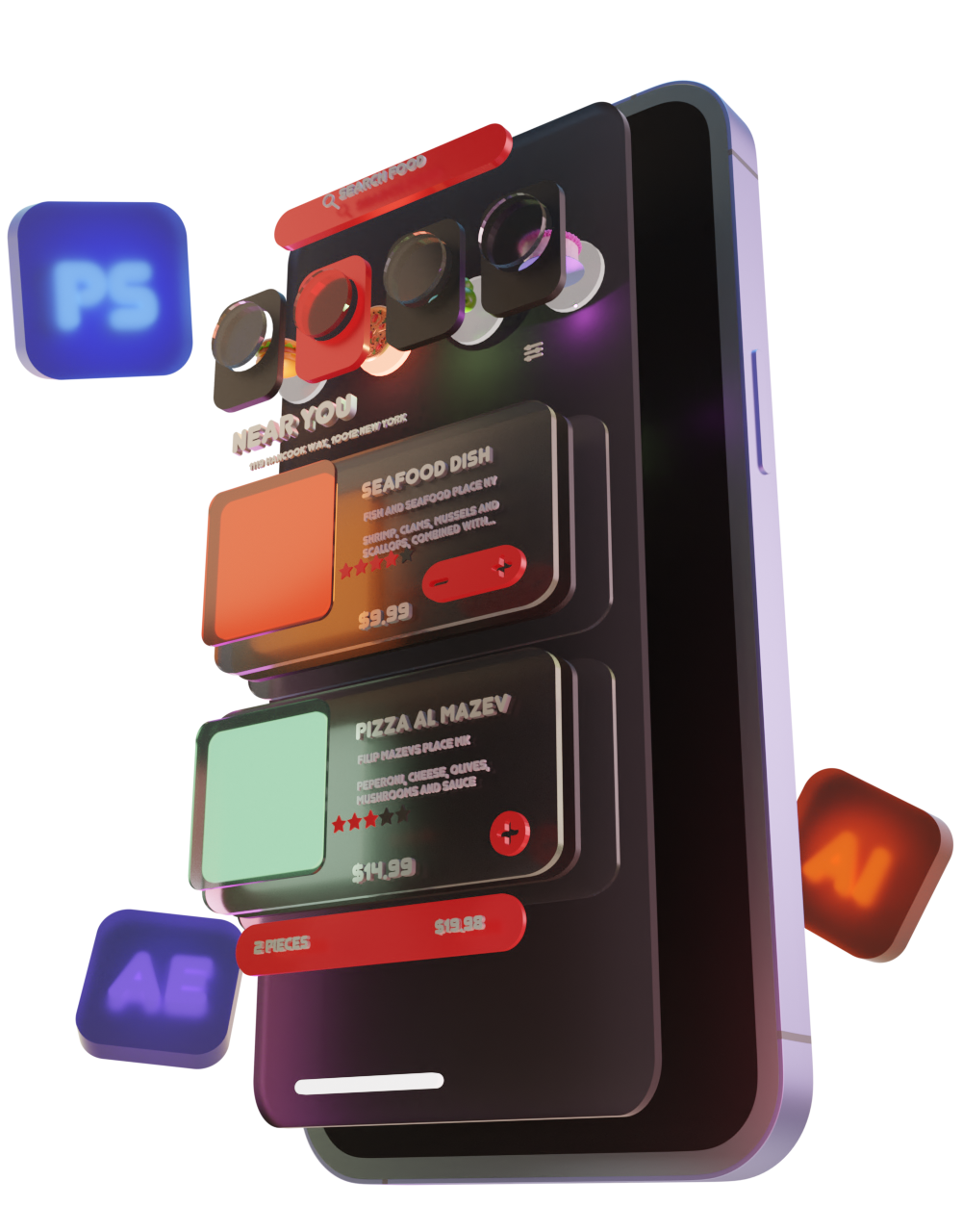
+To achieve a streamlined user experience, the new app design features three functionally distinct sections: a beautiful way to find what to eat with a clean browsing experience in the home section, a simple cart section and an efficient order tracking functionality in the order section. To keep up with the current trends, the new app was designed for both light and dark modes.
Objective
+To create a modernized version of the Macedonian gastronomy platform' app.
Process
+The main inspiration for the new look came from the companies existing app, as this new design was not to deviate too much from the original spirit and identity that their existing app design had. Each existing segment was carefully tuned and given a fresh coat of paint, while the new sections received a new functional design in line with the apps look.
Included
+- Graphic design
- UI/UX design
Year
+2021
RGB (225, 47, 47)
RGB (203, 40, 41)
RGB (255, 80, 53)
RGB (255, 162, 98)
RGB (227, 202, 202)